You guys have been loving our new review series so we’ve decided to devote a whole extra month to it. After Chris tried his hand at reviewing the UX design of The Walnut in Edinburgh, we’ve decided to look a little closer to home and review Caper and Cure, a fantastic independent kitchen-bar in the heart of Stokes Croft.
Let’s get started.
👍
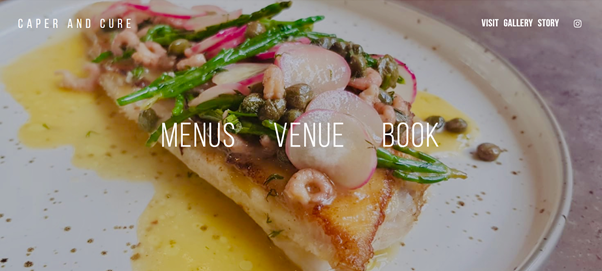
As soon as you click on Caper and Cures website, you’re greeted by deliciousness. It’s clean, sleek and modern, and a great example of less is more. We like the use of three clear buttons and the sweeping imagery (each time you hover over the buttons, the images change) is a nice way of showcasing what they have to offer without overcrowding the page.
👎
We can’t really fault the first impression, but if we had to offer some constructive criticism – we’d suggest a transparent overlay to slightly darken the imagery and help ‘menus’, ‘venue’ and ‘book’ really stand out against the colourful photography.
*Top tip – Caper and Cure have gone for quite an intricate user journey. Eg, you click menus and you go to menus, and then you click a menu and it opens a pdf. For a restaurant, we’d recommend a single page website so that visitors scroll for content rather than click – it just makes sure they don’t stray too far away from your core action – which is booking a table.
👍
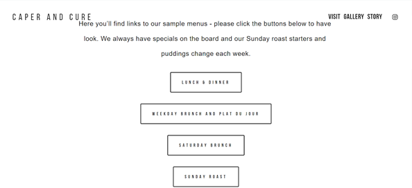
We like things to be straight to the point, so this fuss-free page gets the thumbs up from us. The menu looks incredible too.
👎
If we’re being picky, we would have liked the menu to appear in a new tab for cleaner navigation – you want visitors to be able to navigate as easily as possible back to the “book” call to action. Ideally, you’d also have menus built into the page so all a user needs to do is scroll (it’s all about reducing clicks). However, we appreciate that using a PDF format is easier than building a new page, especially if your menu is particularly seasonal, which for these guys it is. Finally, we’d suggest a ‘book now’ button to be readily available on every page to avoid needing to look too hard for it.
👍
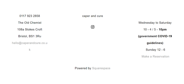
This is decent. It’s functional – gives some of the more mundane information and we like the “make a reservation” call to action (CTA for fellow nerds).
👎
This is fine, but we appreciate that people aren’t buying their opening times and contact details, so we can forgive slightly less attention to detail here.
Here’s what we’d do:
- Bring the make a reservation button into the top of the left hand column and make sure it stands out. It goes there because that will give it the highest position on mobile.
- Move location, opening times and contact details onto the left too and move social and site navigation over to the right (including story, menus). That will appear last on mobile.
- I think we’d also be tempted to highlight the social channels a little more to drive engagement – we nearly missed the instagram link. What about: “follow us for food porn” or similar wording (food porn won’t be to everyone’s taste).
- Finally, normally a footer like this marks the bottom of the page. That wasn’t true for this website – when you scroll down you get the homepage again. We found that a bit unexpected – as a general rule of thumb it’s good to avoid surprises and unexpected user experience – it tends to jar and confuse people – we thought we were stuck in a never ending loop!
👍
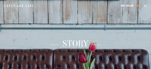
Pages like this add a lovely, personal touch and we’d really recommend adding this kind of thing to your website if you haven’t already. As consumers become increasingly aware and conscious of where they spend their money, it’s good to be able to provide an insight into your backstory/origins. For Caper and Cure, they also went through a name change and so, stuff like this really helps draw a line in the sand and establish your new presence and brand story.
👎
We had a quick glance at mobile, and it looks like these guys have done a good job on mobile optimisation on the whole, but on this page it falls down a bit. There’s too so we’d suggest narrowing the margins, reducing the font size and tightening the spacing between lines to compress it a bit. We’d wager that 80% of Caper and Cure’s traffic will be mobile so it’s definitely worth starting with a mobile first design – the smallest of changes can make a huge difference to user experience.
Top tip – if you want to see what your website looks like on mobile without constantly looking at your phone, just use F12 or right click and inspect and then your desired screen size.
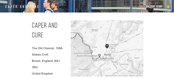
👍
A map is a really good idea for any restaurant – it saves visitors having to leave your site to search on their map. It’s definitely a valuable addition.
👎
‘Visit’ and ‘Book’ appear to feature very similar information (if you scroll down on visit, you can also make a reservation) so to avoid confusion we’d combine these pages. Location is also featured twice on the same page – this space could be used for a glowing customer testimonial (we’re sure there plenty) or team/owners section.
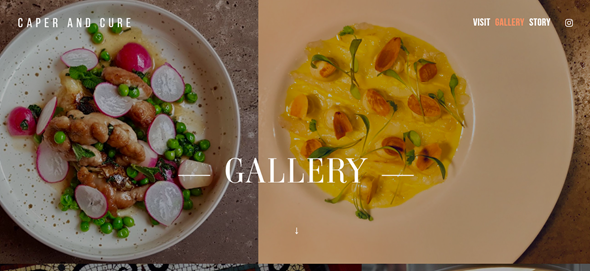
👍
You can’t go wrong with a nice gallery page and Caper and Cures is a beauty. As the saying goes, you eat with your eyes, and these pictures are definitely making my cheese toastie look a bit sad. Top marks from us.