Drawing in customers is an essential part of running your business at the best of times. But, with lower footfall than we’re used to, now is a brilliant time to up your A board or signage game. With countless responsibilities and an endless to-do list, thinking of something creative to write on your A-board might be viewed as low priority, but it’s often the first form of communication between you and the customer, and could be the difference between walking past and actually stopping.
To give you some inspiration, as well as a solid example of how not to do it (see no#5), this week, we’re putting A-boards under the spotlight.
1#The Joker
limber score: 7/10
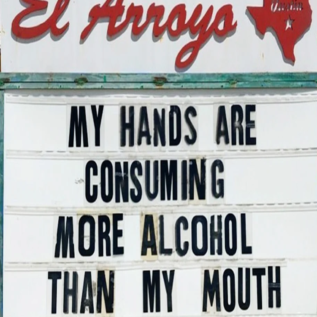
This restaurant uses humor to combat coronavirus anxiety, while getting the message across that they’re thorough – like really clean.
It’s a somewhat inoffensive Covid-19 joke that’s been doing the rounds for a while, so we’re giving this one credit for sentiment, but not for originality.
image via: @elarroyo_atx
2#The Witty One
limber score: 9/10
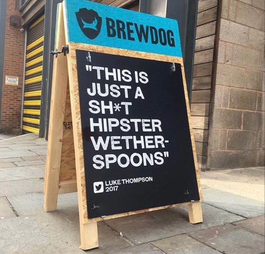
Brewdog have always pulled off great marketing, and they definitely got the last laugh with this one. We love a witty response to a bad review and the ability to make the best from a bad situation is key for survival in the hospitality industry.
The fact they’re willing to make this review public shows that they’re confident in their offering and not afraid of a little criticism.
We’ve also chucked in some extra points for presentation. Never underestimate the power of an A-board that looks as good as it reads – if, like many, your artistic abilities end at a stickman, it’s worth paying someone to do it for you.
The only thing to watch out for here, is making sure this kind of response fits with your brand identity. This clearly works for Brewdog, but isn’t likely to land so well at a fine dining restaurant.
image via: @brewdogliverpool
3#The Directions
limber score: 5/10
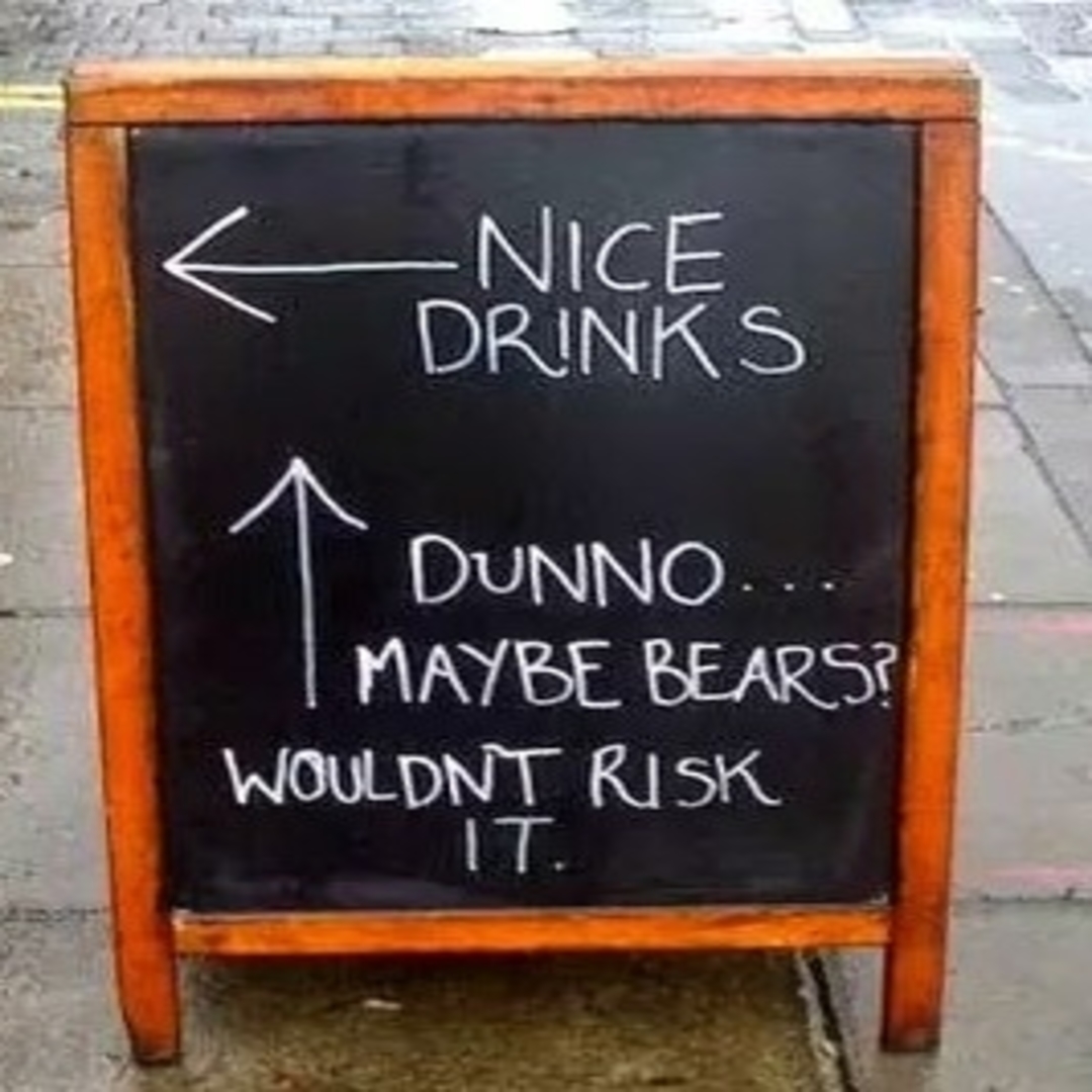
Bears? In the Uk? More like a really big street rat.
The idea’s simple, but the execution is lacking. We get what they’re going for, but not only is the flowchart/arrows format (with the only viable option to come inside) a bit overdone, it also left us feeling a bit confused.
If you’re tempted to go with this format, you’re going to need a new twist on it to keep things interesting.
4#The Threat
limber score: 7/10
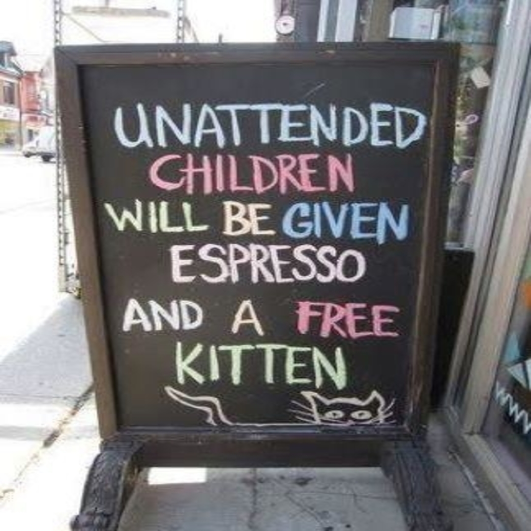
We also wondered if a similar threat-system could be used for keeping drunk people at their Covid secure tables?
These guys have done a decent job of putting a light-hearted spin on something that can sometimes cause a little tension.
With current safety regulations and distancing rules, it’s more important than ever for every customer (even the little ones) to remain seated, and something like this get’s the point across without being too confrontational.
Nicely done!
Image via: @Watchyourchildren
5#The Disaster
limber rating: -1,000/10
Oh dear.
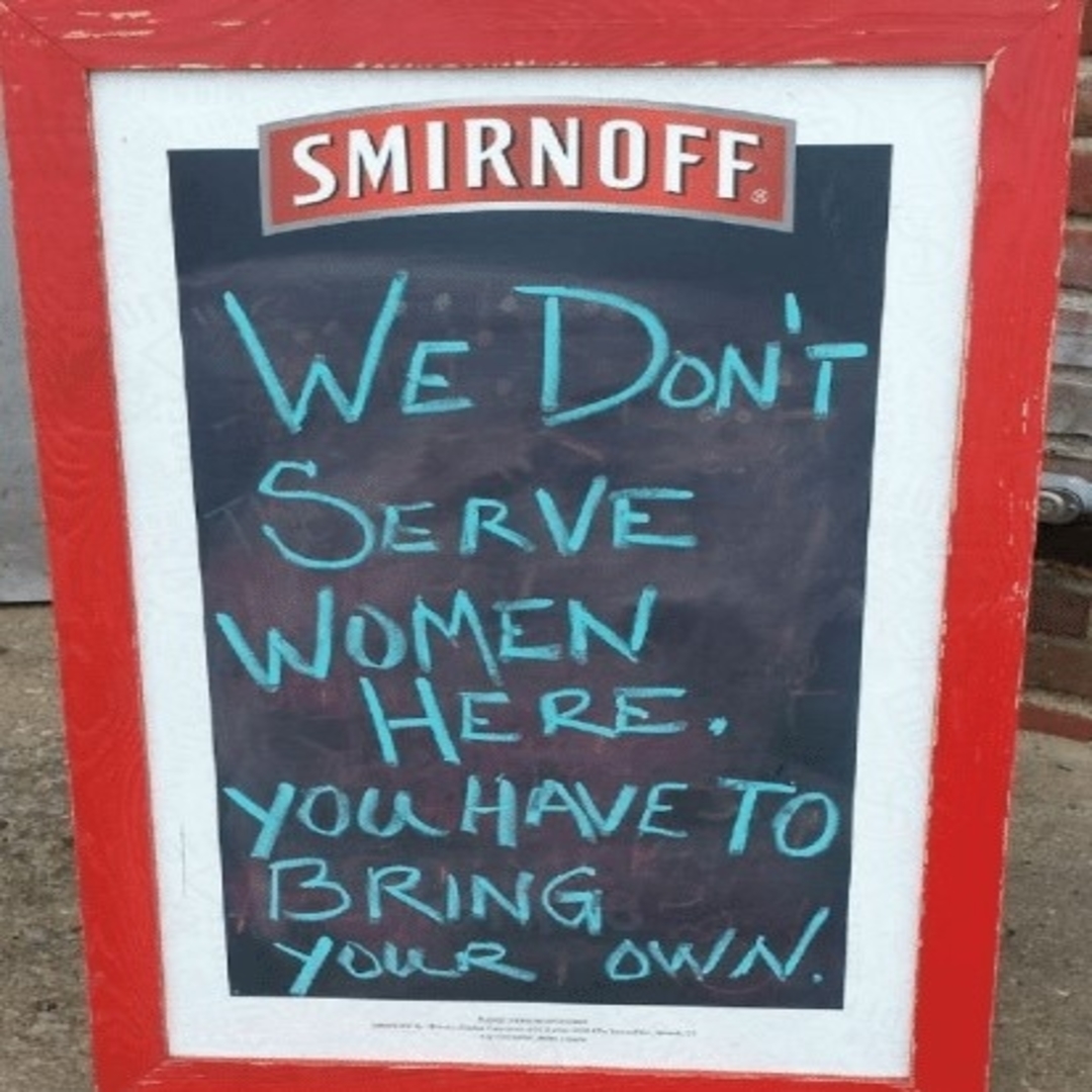
We don’t really need to explain why this sucks – but under no circumstances would we recommend offending a good proportion of potential customers before they’ve even stepped through the door.
We also wouldn’t recommend associating your brand (or that of your vodka supplier) with such statements.
The fact it looks like it was written by a 3 year old just adds insult to injury.


