As many of you know, lately, we’ve been reviewing UX design, and as a team who aren’t afraid of a little self deprecation, we couldn’t let this series pass without taking a look at one of limber’s very early websites from April 2017 (we’re already cringing).
We’ll be the first to say that this website leaves a lot to be desired, but it also proves that web design is a marathon, not a sprint, and that everyone has to start somewhere. This review is primarily an example of how not to do it, and an opportunity to point out some easily avoidable beginners errors, but we also hope it gives you a good laugh because, let’s face it, we probably all need it right now.
First up, a word from Chris, our founder:
“Designing a site for an early stage app is a nightmare. You don’t really have a clue how to sell your product, why it’s useful to businesses and you don’t have much data on how they use it. So we were a bit in the dark. Looking back on this, there’s a lot wrong with it, but there’s also some great stuff, which still holds true today. The guy who designed this now runs a really successful design and product agency called Haio – if you think we’ve come a long way since 2017, you should check him out! – https://haio.design/”.
We used the wizardry of the wayback machine internet archive to find all our old websites, so if you fancy taking your own trip down digital memory lane, you can do so here.
👍
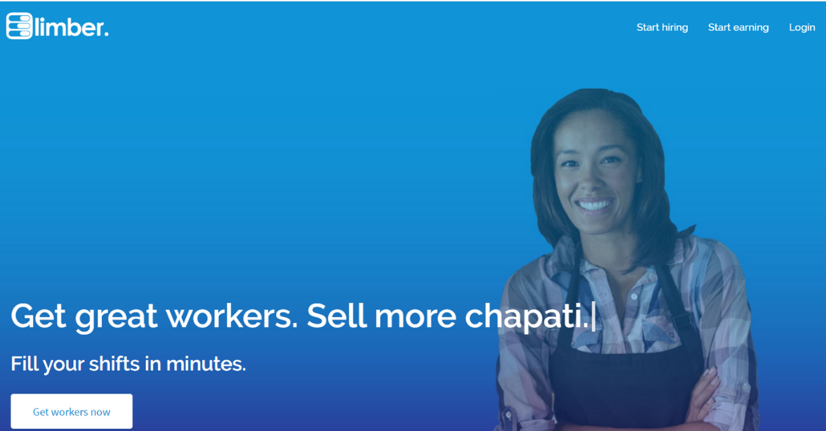
The cool thing about this homepage is that ‘Chapati’, was a piece of dynamic typed text. This image doesn’t do it justice, but when you arrived on this site, a cursor appeared and deleted ‘Chapati’, replacing it with other delicious morsels – flat white, biscotti etc etc…
We thought it was pretty cool at the time.
👎
It’s hard to know where to start, but I’ll admit that I cry-laughed when I first looked back at this page. I’d be willing to put my life on the fact that if you asked ten thousand hirers, why they use limber, not a single one would say ‘to drive my chapati sales’, but nevertheless the sentiment that limber makes running your business easier is there, and still stands true today.
When it comes to a homepage, we always champion the less is more rule – but this brings a whole new meaning to simplicity. The CTA (call to to action button) is fine, but now we would think twice about using the word ‘get’, with hire, connect and find all being far better options.
We were also horrified to find not a single bit of information on pricing without having to navigate away from the page. That’s a big slap on the wrist for us.
This page is also a great example of how not to use colour on your website – we love limber blue (#0f94d7 is the hex code if you’re wondering) but unless you’re a smurf, this is a classic example of having too much of a good thing! Overall, we’re off to a shaky start.
👍
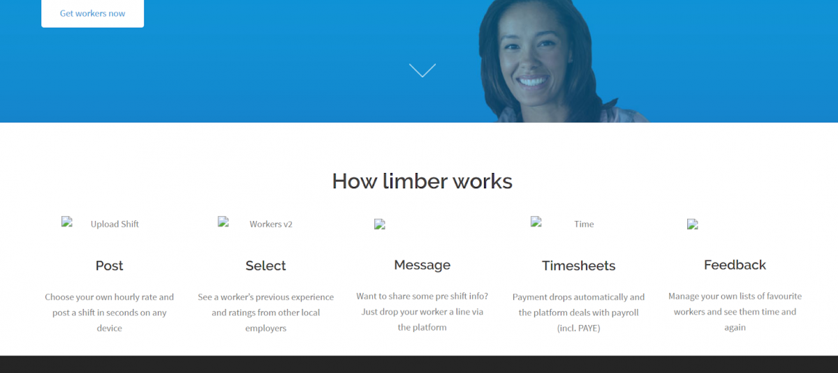
One thing this website does have, is a fairly logical flow – it’s not overly persuasive, but at least it makes sense. While there’s been countless changes and improvements to limber since day 1, this ‘how it works section’ proves we built a solid product that in principle has remained largely unchanged. Unfortunately, web archive didn’t capture the graphics we had here, but we promise they looked good!
👎
The copy under ‘Feedback’ is probably the worst of the lot here – a key tip when writing web copy is to have someone who knows nothing about your business look at it – does it make sense without any prior knowledge? Ask yourself if an alien wanted to use your product, would they be able to? We think we probably fail both tests here.
👍
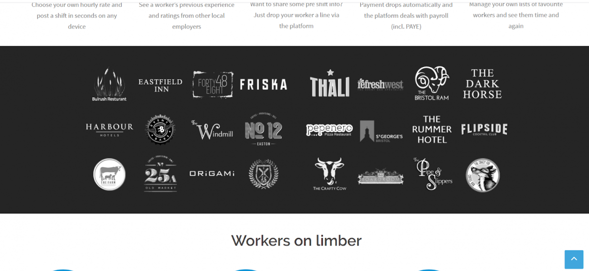
From how it works, we move straight on to businesses on limber – testimonials are always a strong addition to any website. It’s a great way to reinforce trust and create a sense of community.
👎
In hindsight, this section doesn’t actually demonstrate how limber can benefit businesses. Now, we feature a selection of customer stories which highlight ‘pain points’ and how we can solve them, rather than just a list of logos.
👍
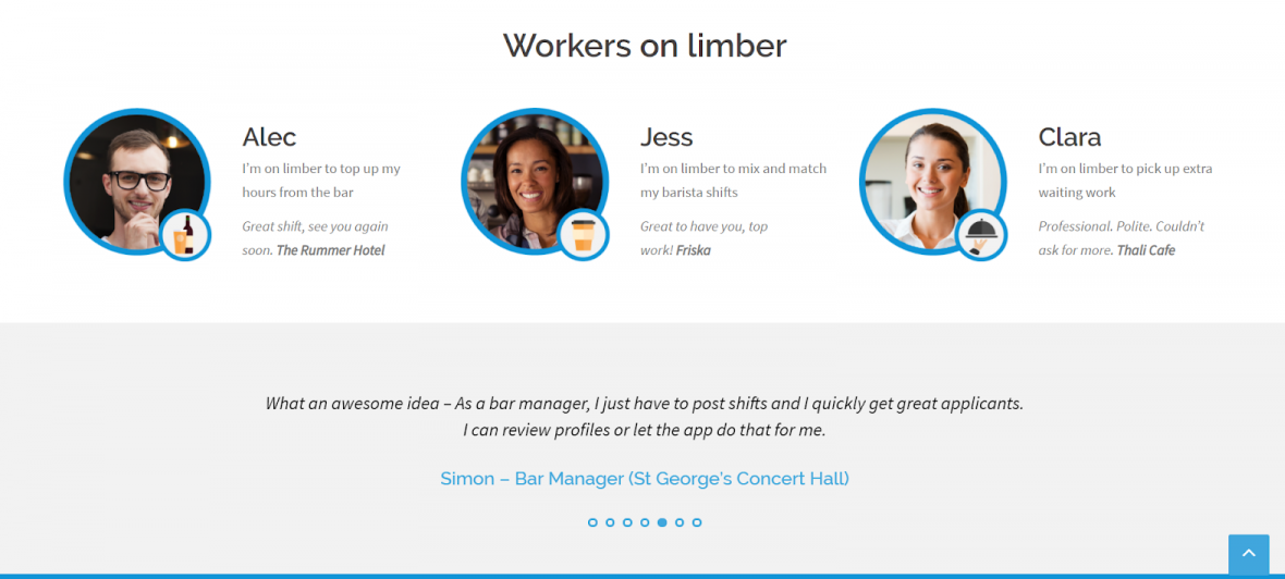
This is the best section of the entire homepage, which says a lot, but we’re giving ourselves half a point for the far more balanced use of colour and the ok layout.
👎
Looking back, it’s super confusing to have a worker testimonial followed by feedback from a venue directly underneath, but I get what we were going for.
It’s also important to note that increasing trust isn’t just about testimonials – unbelievably, the homepages include nothing on features, payroll, right to work checks, secure payment (the list goes on) and many of the details we would now consider vital.
👎
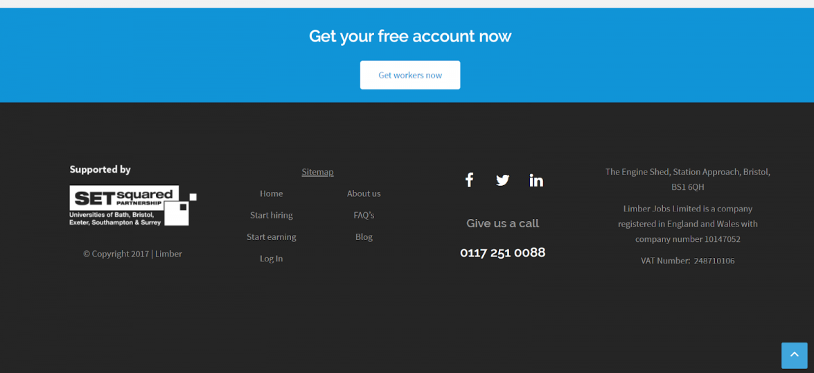
‘Get your free account now’ is fine, but that space could have been put to a far better use – the main problem with this website is the sheer amount that’s missing. What about a mission statement, or a photo of the team? Customers don’t want to have to click around for hours to paint a full picture.
Here are a list of the questions we failed to answer with our homepage:
- How much does it cost?
- How do you vet workers?
- What are the benefits of using limber?
- What info do you need from me to post a shift?
- Are there any joining fees?
Perhaps worst of all, is that you had to sign up to use our platform. When you clicked ‘Get workers now’, you got a boring form. Then you had to validate your email. Then you got another boring form. Then, at that point, we showed you how the product worked, what information we needed from you to post and finally, how much it actually cost.
A really important mantra in web development is show don’t tell, that’s why in our latest effort, https://limber.work all the key info is up front. You can calculate how much your shift will cost you and you only sign up if you’re sure you want to post a shift. We’ve got some exciting new additions coming to this website, but we’re pretty proud of how far we’ve come.


